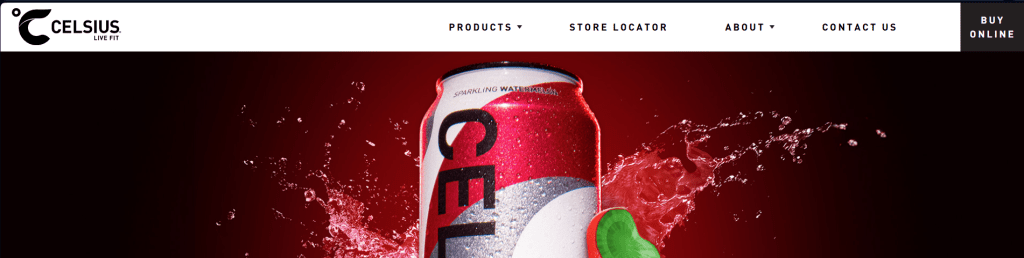
The energy drink industry is saturated, fiercely competitive, and in a continual state of transformation. Celsius, a company that is dedicated solely to fitness and wellness, has emerged recently as one of the top competitors in this space. Celsius promotes its products as a better-for-you beverage choice compared to many other available energy drinks by utilizing the brand’s motto: Live Fit. Each drink in the Celsius line is marketed as a drink that can help with energy levels, metabolic rates, and enhancing performance during workouts.
With that being said, how effective is the Celsius website at providing the user with enough information to decide on which product to buy, posting comparisons of product options and being able to learn more about Celsius products?
To find out how well the Celsius website met these goals, I conducted an extensive user experience (UX) research project focused on assessing the usability, structure, and overall effectiveness of the Celsius website. I conducted multiple types of UX research (e.g., user interviews, user surveys, card sorting, heuristic evaluations, and usability testing) in order to evaluate how real users are using the website and where improvements could be made.
Meet Celsius
Celsius presents its business as offering energy drinks and not just drinks for providing energy: it also promotes well-being, exercise, and increased performance, appealing to people seeking energy; however, they do not want energy drinks that produce sugar crashes like other types of energy drinks.
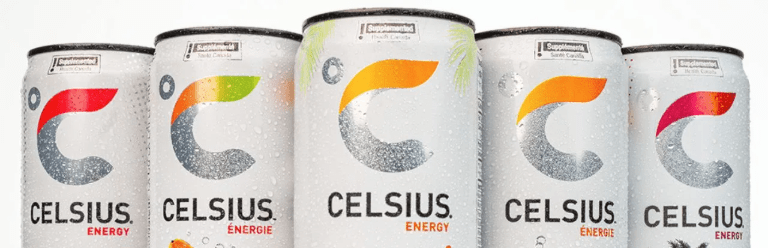
The site displays this image through the use of large graphics, activity-related graphics, and a high degree of emphasis on fitness or health through all of their design and layout elements. The four categories of products listed on the site (Original Energy Drink, Essentials, Hydration, and On-The-Go), together with benefit-based propositions related to increased metabolism, improved exercise performance, and sustained energy levels, are complimentary to this concept.
Although the site is successful in portraying the company’s energetic and contemporary brand image, research indicated that effective branding sometimes detracts from the user experience.
The Users
In the process of creating user personas, three main types were developed to help identify rest of the world’s average user of Celsius products. These personas are as follows:
- The Fitness Professional: This persona is a goal-oriented individual who tracks their workouts, macronutrients, and performance levels in order to accurately prepare for the next event. The Fitness Professional seeks the cleanest, most scientifically validated and functionally beneficial ingredients from their energy drink.
- The Busy Parent: Fitness-oriented parents with busy family lives will be looking for energy that is both smarter than and lighter than other energy drinks.
- The Lifestyle Consumer: The Lifestyle Consumer is an individual who is very socially connected to their friends, family, and the population at large, and considers the products they consume (like energy drinks) to be an extension of their identity. Their decisions to consume energy products will be influenced heavily by trends, their peers, and how the brand represents them.
The personas created for these three user types were used as a basis for developing user research questions, as well as to define realistic motivations for conducting usability tests on the Celsius website.
The Research

A variety of UX research methods were employed to evaluate the user experience of the Celsius website.
Interviews
Interviews revealed how users look for product information and what they aim to find on a brand website. Researchers asked users about their common browsing behaviours, device usage, and what issues they encounter when trying to navigate product pages online.
Surveys
Through a brief survey, researchers were able to collect anonymous evidence of user’s behaviour while on the Celsius website, including why users are on the site, what type of device they are using, and what type(s) of information they are trying to reach.
Card Sorting
To learn how participants view the underlying structure of the information contained on the Celsius website, card sorting was used. Participants were asked to group 30 topics (such as product lines, ingredient lists, new promotions, and corporate information) into made-sense categories.
The results provided insight as to areas where people had similar opinions of what type of product and shopping categories they could understand and areas where people did not have a clear understanding (i.e., corporate information).
More defined separations between product information, credibility content establishing the brand’s credibility, and shopping capabilities (e.g., checkout) could be used to create improved navigation.
Diary Study

The purpose of this study was to monitor how users interact with the site over time, so users agreed to log each time they visit the site over the course of one month, what they were doing on that visit, and whether or not they experienced any difficulty finding their way around the site.
This method can help detect user behaviors that come out through a single session test.
Heuristic Evaluation
Using Jakob Nielsen’s usability principles, the site was reviewed for common design strengths and weaknesses.
Strengths of the site include:
- Strong visual branding
- Consistency in layout and navigation
- Clear association with fitness and performance
- However, several potential improvements were found, including:
- Limited filtering and searching options
- Minimal indication of slower page loads
- Unhelpful explanations of errors
Usability Testing
Three participants completed a set of exercises on the website, including:
- Finding product lines/flavors
- Comparing products by ingredients and caffeine content
- Locating retailers via the store locator
- Finding mission and ingredient information for the brand
- Contacting customer service
Overall, participants were able to complete their tasks as intended, however there were several issues with usability that were identified.
What Users Found
Data from participants indicate that they had an energetic, modern, bold and motivational experience while using the site; however, they also described it as overwhelming and full of information overload.
There was an overall high cognitive load associated with navigating the website since there is a great deal of information presented along with a lot of visual stimulation; while the site did function correctly and all the technical aspects are working properly, the sheer amount of information and visual stimuli will cause users to take longer to make an informed decision.
The participants had difficulty:
- Comparing products from different product lines
- Understanding how much caffeine is in the product
- Finding the product they are interested in quickly within the large amount of data present on the site
Another common comment was that they would have to explore multiple product line areas in order to understand how the products between the line differ from one another.
Overall, two out of three participants would consider purchasing Celsius’ products based on the strength of the branding and visible nutritional information presented on the site.
Opportunities for Improvement
The findings of our research confirm the notion that there are many options available for improving the Celsius website.
1) Simpler Comparison of Products
- Finding new and easier ways of allowing users to compare products based on their type, amount of caffeine, and benefit.
2) Reduced Cognitive Overload
- Having simplified versions of product pages that show specific nutrition information will help the user make faster decisions.
3) Improved Information Architecture
- Separating product pages from non-product pages (i.e., brand trust, research studies about the efficacy of these products, sustainability) will create a better navigation experience for the user.
4) The Use of More Filtering and Search Capability
- Creating new filters and search capabilities based on taste type, caffeine levels, and product types will make returning and new users have a better experience locating products.
The Bottom Line
Celsius communicates well with its brand identity and inspires users through the clearly defined “Live Fit” message. The visual design has been carefully constructed to represent the energy of the brand and its performance aspect. However, UX research has shown there are many opportunities for improvement in usability.
For example:
- Product comparison
- Clarity of navigation
- Structure of information would dramatically increase the usefulness of the website as a functional tool.
The opportunity exists for Celsius to develop a website that clearly aligns its strong brand identity with user-centered design elements and creates an experience that will not only motivate users but will also give them confidence when making a purchase.

Leave a comment