Having completed the planning phase, it’s time for the next step: branding. At this stage, you’re really starting to build a portfolio and see it take shape. Prior to this stage of development, you’ve done a lot of work preparing for all of the elements (content organization, defining your purpose, and considering the structure). The difference is that you will use visual branding to put a personality to your portfolio (let others know who you are and the type of work that you create through your visual communications).
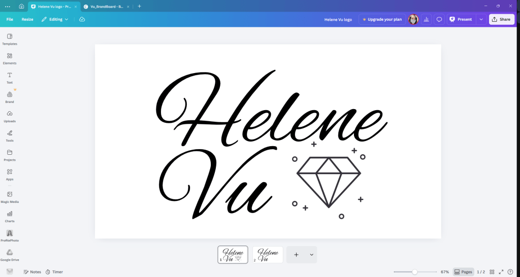
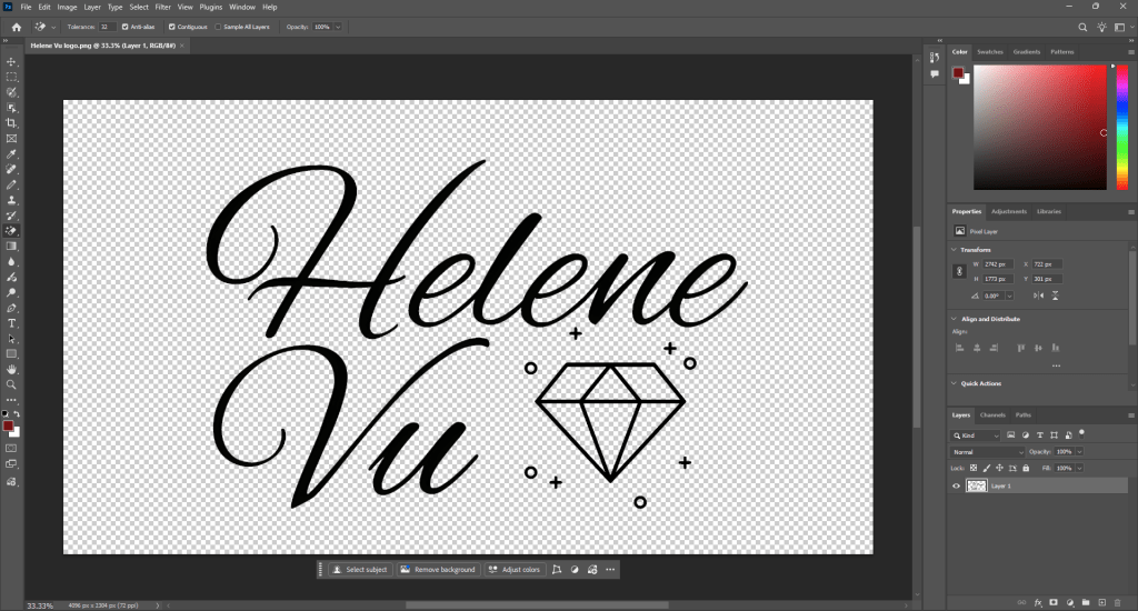
Branding for me began with the creation of a logo. I created multiple versions of my logo using both Canva and Photoshop to try to create a logo that represented myself and my brand. I was able to create many rough drafts using Canva. Once I had a clear idea of my logo vision, I began using Photoshop to create more polished versions (especially the diamond since I want it to be black like my name). I went through multiple iterations before I was able to develop a logo that reflected my image but was not overly complex. I wanted my logo to be clean, modern, and flexible to use for any type of work within my portfolio.
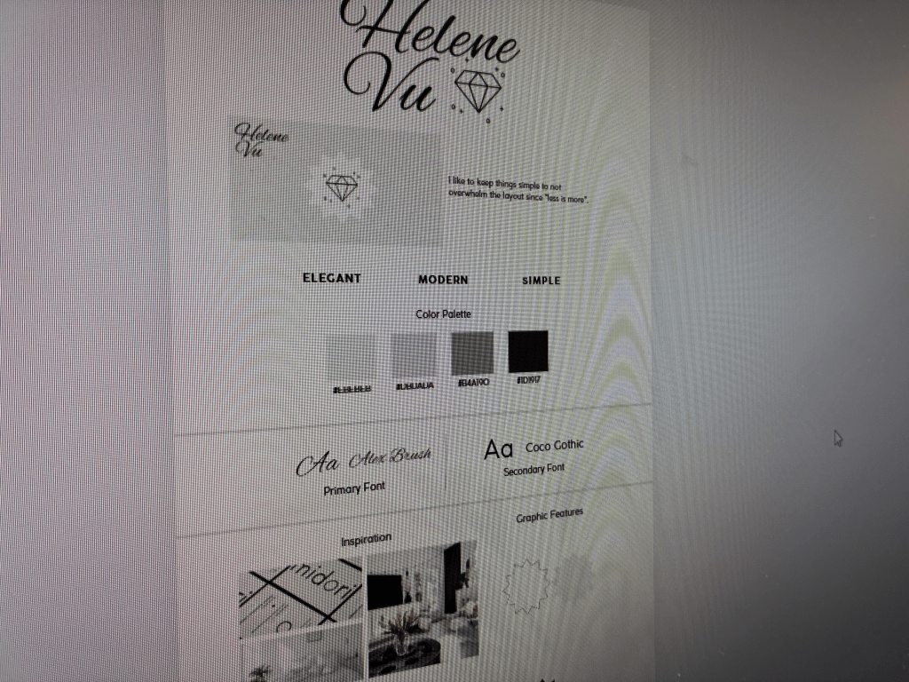
After finalizing my logo, I made the transition to establishing my brand board. This encompassed my vision for every aspect of my overall brand identity and gave me direction when I would begin designing my portfolio. The inspiration for my brand board was pulled directly through my own personality, style of design, and artistic preferences. I tend to gravitate toward simple, clean, and minimal designs that have great user experience, and I wanted this to be the basis of my brand. Instead of cluttering the viewers’ experience with unnecessary elements, I chose to create something with a very intentional and cohesive look.
The brand board reflects that way of thinking. I opted to use a black-and-white color palette with subtle gray accents. This color palette was intentionally selected. Black and white create a highly contrasting and highly professional and classic through time look, while gray adds enough variation to keep you engaged without overwhelming the subtlety of the overall design. Using this color palette also allows my portfolio to have more visual impact because the designs do not compete for attention with the other design elements.
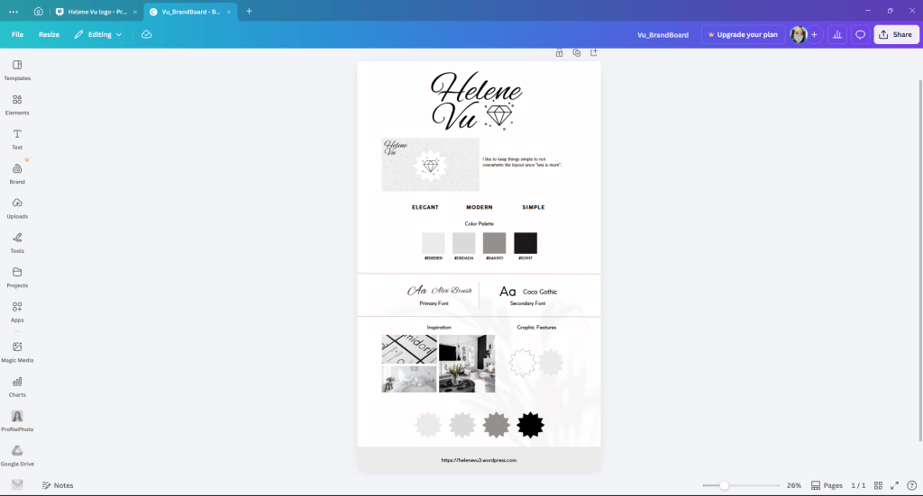
When developing my brand, I focused on typography and tone along with my intended colors. I went with primarily clean, modern typefaces which are legible and complement the clean, minimalist look I am after; all of the pieces of my branding as seen here work together to ensure a cohesive look and feel across my entire portfolio.
This step of the process has been extremely important as it links the planning phase to the implementing phase of building; I now have a well defined visual direction that will serve as a guide as I continue building out my portfolio. It has made my decision making process much easier and helped maintain continuity within each piece.
Branding is not simply about creating a visual aesthetic; rather, it creates an overarching representation of who you are in terms of your visual language. For me that means using an intentionally clean and authentic look.

Leave a comment