
I decided to spend a week tracking something I do almost without thinking about it: watching things online. Streams, gaming videos, music, clips — the background hum of my day. I wanted to see if drawing it out by hand would make me actually notice patterns I couldn’t see just by living inside them.
Why this project, and why by hand
This whole idea is inspired by Dear Data, the year-long project where information designers Giorgia Lupi and Stefanie Posavec mailed each other hand-drawn postcards instead of using an app to track their lives. They chose analog drawing specifically because automated collection felt like giving up control over their own data — the drawing itself was part of understanding it (dear-data.com). That idea stuck with me going in: the point isn’t just to log numbers, it’s to sit with them long enough to draw them by hand.
How I tracked it
For seven days, every time I started watching something, I jotted a quick note: the time, how long it lasted, what platform it was on, what kind of content it was (VTuber stream, gaming video, music, or clip), and — the part I actually cared about most — why I was watching. Was I actually paying attention, was it just background noise while I did something else, or was I mindlessly scrolling?
Turning it into a drawing
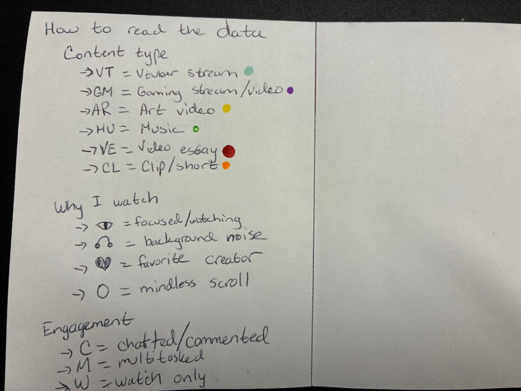
I represented each day as its own circle, like a little clock face. Position around the circle showed what time I was watching, and color showed the content type. The “why” behind each session became its own mark inside the dot. Putting all seven days side by side on the card let me see the shape of my whole week at once instead of just remembering scattered moments.
This kind of two-question thinking — what am I trying to show, and how should the shape of the drawing reflect that — echoes Scott Berinato’s framework for chart-making, which asks whether a visualization is meant to declare something or help you explore something, and whether it’s showing a concept or real data (Berinato, Visualizations That Really Work, HBR, 2016). Mine leans toward exploration — I didn’t know what I’d find going in, and the drawing was how I found out.
What I actually found
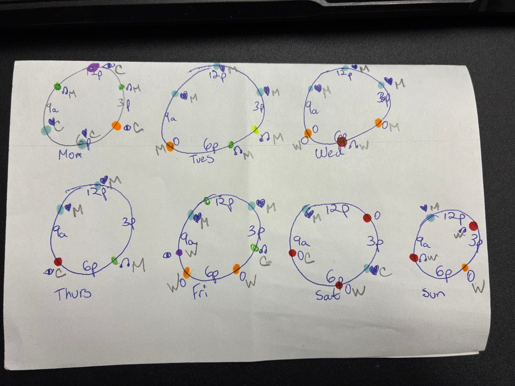
The clearest pattern: my weekends were noticeably heavier than my weekdays. Saturday and Sunday had bigger, denser clusters of dots than any weekday. That makes sense on reflection — I’m home and off work, so there’s simply more open time for it to fill. But seeing it laid out spatially made the contrast much starker than just “knowing” it intuitively. My weekday circles were sparse and scattered across a few pockets of time; my weekend circles were crowded, especially in the afternoon and evening stretches.
It also made me notice how much of my weekend watching fell into “background noise” or “mindless scroll” rather than actually sitting down to watch something I cared about. That wasn’t something I expected to see so plainly until it was sitting there in ink.
Why this mattered as an exercise
Drawing my own data by hand slowed me down in a useful way. A spreadsheet would have given me the same numbers, but it wouldn’t have made me sit there coloring in a dot and asking myself, honestly, why I was watching in that moment. That’s the same thing Lupi and Posavec found in their own project — that hand-drawing forces a kind of attention that automated tracking skips right past.
Sources: Dear Data project by Giorgia Lupi and Stefanie Posavec; Scott Berinato, “Visualizations That Really Work,” Harvard Business Review, June 2016.


Leave a Reply