
My first Dear Data postcard mapped my week by the hour, a clock face tracking when I watched, scrolled, or half-listened to something in the background. This time I turned the same instinct toward a different kind of noise: email. Not the emails landing in my inbox, but the ones I actually sent out, day by day, for a week. It’s a smaller, quieter dataset than a whole inbox, but it turned out to be a more honest one, because every email I send is something I chose to write, not just something that arrived.
Giorgia Lupi and Stefanie Posavec spent a year mailing each other postcards built from exactly this kind of overlooked personal data — how often they laughed, who they spent time with, the small emotional weather of an ordinary week — and turned it into something legible by hand, one drawing at a time (dear-data.com). What I keep coming back to from their project isn’t the visual style so much as the discipline behind it: pick a handful of variables, track them honestly for seven days, and trust that the shape of the data will say something you couldn’t have said directly. I wanted my own postcard to have that same plainness, so I kept it to one variable measured two ways: how many emails I sent each day, and what kind they were.
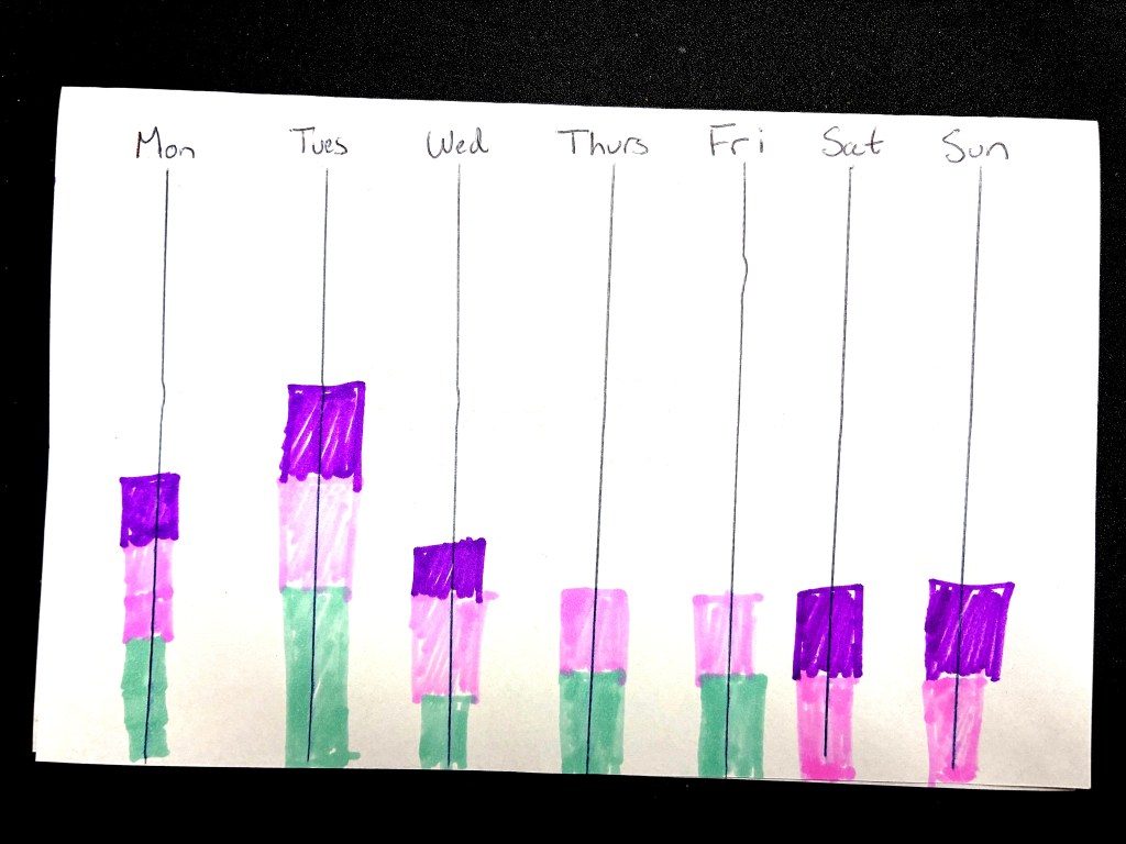
The drawing ended up as seven bars, one per day, Monday through Sunday, each built out of colored segments stacked on top of each other like a tiny bar chart drawn freehand. Green is work-related, pink is personal, and purple is school-related, and the height of each color block is just how many emails of that type went out that day — so a tall green block means a heavy work day, a short pink sliver means barely any personal correspondence. The whole bar’s height is dependent on volume alone, nothing normalized or averaged, which meant the drawing did something I didn’t fully plan for: it turned a week of sending emails into a silhouette, a little skyline where the tallest building is whichever day I was busiest.

Once it was drawn, the shape told me things I hadn’t noticed while living through the week. Tuesday is the tallest bar by a wide margin, stacked with school on top of a thick band of personal email in the middle and work at the base — the day everything seemed to need a reply at once. Weekends look almost nothing like weekdays: Saturday and Sunday have no green at all, no work email whatsoever, just purple school correspondence sitting on top of pink personal messages, like my inbox politely respects the concept of a weekend even when I don’t. Thursday and Friday are the inverse of the weekend in a different way — no purple, no school email at all, just personal and work stacked cleanly on top of each other, as if school simply took those two days off. Seeing all seven days lined up side by side made the pattern obvious in a way that living through one day at a time never does: school email clusters at the start and the tail end of the week, work email disappears the second Saturday arrives, and personal email is the one category that never fully drops out, showing up in every single bar no matter what else is happening.
Scott Berinato’s framework for thinking about visualization splits work along two axes — conceptual versus data-driven, declarative versus exploratory — and this postcard sits pretty firmly on the exploratory, data-driven end: I didn’t know the weekend would look like that until I’d stacked the colors and stood the bars up next to each other. That’s the appeal of doing this by hand instead of just glancing at a sent-mail folder. A folder tells you the count. A postcard makes you notice the shape.
There’s something a little vulnerable about a chart built entirely from what I chose to send, rather than what happened to me. It’s a record of effort and obligation more than mood — every purple block is a professor I owed a reply, every green one a task I pushed off my desk. But that’s exactly the kind of quiet, unglamorous data Lupi and Posavec were after in the first place: not a highlight reel, just an honest week, drawn out in ink so it finally holds still long enough to look at.


Leave a Reply