

Every chart, diagram, or infographic is really answering two quiet questions before it answers the loud one on the page: what kind of information is this, and what am I trying to do with it? That’s the premise behind a framework from Scott Berinato, a Harvard Business Review senior editor, in his 2016 HBR article “Visualizations That Really Work” (later expanded into his book Good Charts). Berinato argues that before picking a chart type, a designer should ask whether the underlying information is conceptual (built from ideas) or data-driven (built from numbers), and whether the goal is declarative (to state a conclusion) or exploratory (to go looking for one). Cross those two questions and you get a 2×2 grid — and four very different jobs a visual can do.
Conceptual-Declarative: Idea Illustration
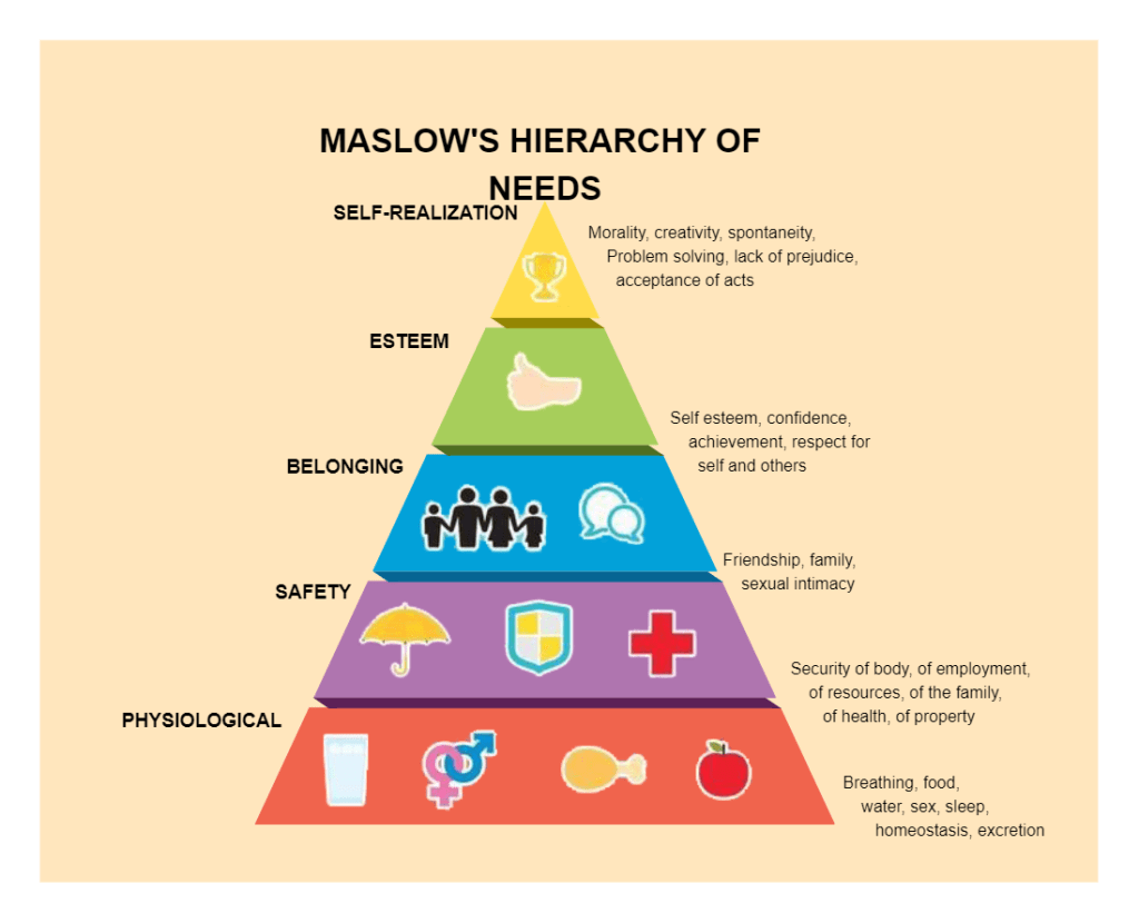
This quadrant uses a metaphor — a pyramid, a ladder, a cycle — to make an abstract idea click instantly. There’s no underlying dataset; the shape itself carries the meaning. A textbook example is Abraham Maslow’s Hierarchy of Needs pyramid, still reprinted in psychology courses and management training decks everywhere.
The goal is pure teaching: compress a theory about human motivation into a shape everyone already reads correctly — bigger base, more fundamental need. It works because a pyramid is a familiar cultural symbol for “foundation supports everything above it,” so the viewer does half the interpretive work before reading a single label. This is exactly the kind of visual Berinato says belongs in presentations and classrooms, where the priority is simplifying a framework, not proving a claim with evidence.
Conceptual-Exploratory: Idea Generation

Here, ideas are still the raw material, but instead of arriving at one clean takeaway, the visual is a workspace for discovering connections. The classic form is the mind map: a central topic branching outward into associated concepts, sketched on a whiteboard or napkin during a brainstorm.
A good mind map is loose and unfinished-looking on purpose — that messiness is the feature, not a flaw, because it signals “still thinking” rather than “here’s the answer.” Its effectiveness comes from encouraging free association: branches can cross, double back, or dead-end without breaking anything, which is exactly what a rigid, declarative diagram can’t allow. This quadrant lives in strategy sessions and design-thinking workshops, where the point is to widen the field of ideas before narrowing it.
Data-Driven-Declarative: Everyday Dataviz
Once real numbers enter the picture, a declarative visual is making a specific, defensible point with them. One of the sharper examples comes from David McCandless’s Information Is Beautiful project: a chart comparing how many UK drug deaths were actually reported by coroners each year against how many were mentioned in UK newspaper coverage of each drug. The mismatch is stark — some drugs are covered by the press far out of proportion to their real death toll.
The goal isn’t to invite debate; it’s to land one argument (media coverage of drug deaths is badly skewed) using a small, clean dataset that doesn’t need narration to be understood. That’s Berinato’s definition of this quadrant almost exactly: simple, low-volume data, presented so the conclusion is unmissable at a glance.
Data-Driven-Exploratory: Visual Discovery

The last quadrant is where large or messy datasets get put in front of a viewer so they can find the pattern, rather than being handed one. McCandless’s “Mountains Out of Molehills” graphic — plotting decades of media panics (bird flu, Y2K, killer wasps) as a timeline of spikes — is a strong fit. No single spike is the point; the point emerges only once you scan the whole shape and notice how repetitive and short-lived these panic cycles are.
McCandless’s TED talk, “The Beauty of Data Visualization,” leans hard into this idea of visual pattern-finding. He describes visualization as a form of knowledge compression — a way to fit enormous datasets into a space small enough for the eye to scan in seconds — and points out that sight is by far our highest-bandwidth sense, borrowing a comparison from Danish physicist Tor Nørretranders to argue our eyes can absorb information much faster than we can read or listen to it. His example of scanning Facebook status updates for the phrases “break up” and “broken up” to reveal predictable seasonal peaks in relationship breakups is a nice real-world case of this same exploratory quadrant: nobody declared an answer in advance, the pattern was sitting in the noise until it was visualized.
Choosing Among the Four
None of these four is “better” — they’re suited to different moments. Reach for conceptual-declarative when teaching a framework, conceptual-exploratory when generating ideas as a group, data-driven-declarative when you have a specific finding to defend, and data-driven-exploratory when you’re still hunting for the finding. Berinato’s real point, and McCandless’s too, is the same one: figure out the job before you pick the chart.
Sources
- Berinato, S. (2016). Visualizations That Really Work. Harvard Business Review.
- McCandless, D. (2010). The Beauty of Data Visualization. TEDGlobal.
- McCandless, D. Drug deaths vs. media coverage chart and “Mountains Out of Molehills,” Information Is Beautiful.
- Maslow’s Hierarchy of Needs pyramid — widely reproduced diagram, original concept from Maslow, A. H. (1943). “A Theory of Human Motivation.” Psychological Review.


Leave a Reply