
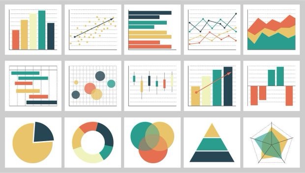
We’re living in a golden age of data visualization. Tools like Tableau, D3.js, and Flourish have made it possible for anyone with a laptop and a curious mind to turn a spreadsheet into something beautiful. But like most technological leaps, this one comes with tradeoffs worth thinking through.
The Pros
Accessibility is the biggest win. A decade ago, building an interactive chart required real coding chops. Now, drag-and-drop platforms let marketers, teachers, and small business owners visualize their own data without hiring a specialist. That democratization matters — it means more people get to ask questions of their own information instead of outsourcing that curiosity.
Interactivity changes what a chart can do. Static charts tell you one story. Interactive ones let the viewer explore multiple stories inside the same dataset — filtering, zooming, hovering for detail. A well-built dashboard can serve a data analyst and a curious layperson at the same time, which used to require making two separate charts entirely.
Real-time data has changed the stakes. Live dashboards during elections, pandemics, or financial markets let people watch a situation unfold rather than reading about it after the fact. That immediacy builds a kind of public literacy around data that simply didn’t exist when charts were static images in the morning paper.
The Cons
More power means more ways to mislead. The same tools that make honest visualization easier also make deceptive visualization easier. Truncated y-axes, cherry-picked date ranges, and misleading color scales are just as achievable in a slick modern tool as a shoddy one — arguably more so, because polish reads as credibility. A gorgeous chart with bad axes is more dangerous than an ugly one, because people trust the gorgeous one more.
Complexity can become a substitute for clarity. There’s a temptation, once you have every visualization type at your fingertips, to reach for the most impressive one rather than the most legible one. I’ve seen 3D pie charts and radial bar charts that clearly started from “what can this tool do” rather than “what does this data need.”
Data literacy hasn’t kept pace with data tooling. We’ve made it easy to produce sophisticated charts, but we haven’t correspondingly improved the average viewer’s ability to critically read them. That gap is where misinformation slips in — not through fabricated numbers, but through honest numbers presented in a way that nudges the wrong conclusion.
What Makes a “Good Chart”?
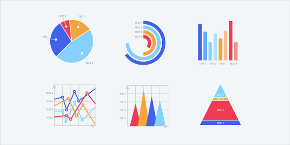
For me, a good chart earns its complexity. It should never be more complicated than the story it’s telling requires. The best charts make you feel like you understood something a half-second before you could explain how — the insight lands before the analysis does. That means real thought about hierarchy: what’s the one thing this chart needs to communicate, and does everything else on the page support or distract from that?
A good chart also respects the viewer’s time. It doesn’t require a paragraph of instructions to parse. And critically, it’s honest by design — proportional axes, clear baselines, no manipulated scales — because a chart that requires trust in the chart-maker’s honesty rather than the chart’s own transparency has failed at its basic job.
What I Respond to Most
Personally, I’m drawn to visualizations that reveal pattern through repetition — the same simple visual unit used over and over until a shape emerges that a single data point never could have shown. The Dear Data project is a great example: designers Giorgia Lupi and Stefanie Posavec spent a year mailing each other hand-drawn postcards, each one visualizing a different slice of their week — how often they complained, when they felt envious, how many doors they passed through. Posavec’s Week 4 entry, “Mirror Mirror on the Wall / A Week of Mirrors,” tracking every time she looked in a mirror, isn’t sophisticated in a technical sense. It’s hand-drawn on the back of a postcard. But the visual rhythm of repeated marks makes the habit visible in a way a sentence like “I checked the mirror dozens of times this week” never could.
That’s the quality I chase in good data visualization: not more data, not fancier tools, but a visual language that makes an invisible pattern suddenly undeniable. The chart should do the noticing so the viewer doesn’t have to.
Sources


Leave a Reply